A practical guide for ecommerce store owners who want fewer obstacles between shoppers and checkout.
Your products are solid. Your traffic looks healthy. Yet sales still feel lower than they should be. Often, the problem isn’t the product — it’s the store around it. Ecommerce design mistakes quietly add friction at every step, from the homepage to the checkout button.
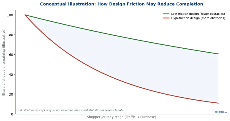
Every extra obstacle gives a shopper another reason to leave.
In this guide, you’ll learn twelve of the most common design mistakes that hurt conversions, why they matter, and simple ways to fix them.
1. A Cluttered Ecommerce Homepage Overwhelms Shoppers
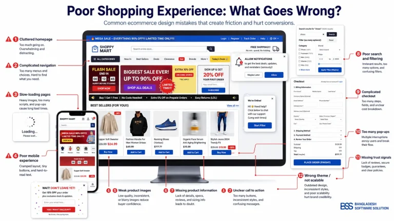
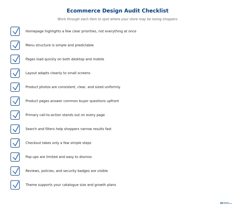
When a homepage tries to promote everything at once, shoppers struggle to know where to look. Too many banners, sliders, and competing messages create decision fatigue. For example, a homepage with five rotating banners and ten featured categories leaves visitors unsure what to click first. Fix this by choosing one clear priority per section and giving it room to breathe. A focused homepage guides shoppers; a crowded one confuses them.
2. Complicated Navigation Makes Products Hard to Find
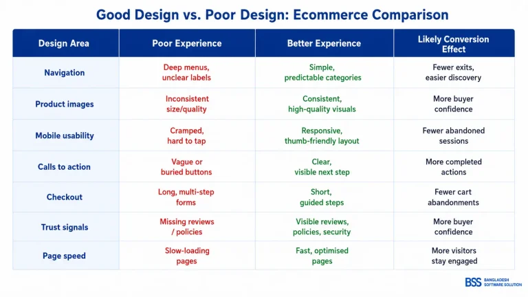
If shoppers can’t find what they’re looking for within a few clicks, many simply leave. Deep menus with unclear category names force people to guess. A store with categories like “Collection A” or “Series 2” instead of clear product types is a common example. Fix this with a simple, predictable menu structure and descriptive labels. Clear navigation keeps shoppers moving forward instead of backing out.
3. A Slow Ecommerce Theme Costs Attention and Sales
Slow-loading pages test a shopper’s patience before they’ve even seen your products. Heavy, unoptimised themes with oversized images are a frequent cause. A product page that takes several seconds to load can lose visitors before it fully appears. Fix this by compressing images, limiting unnecessary scripts, and choosing a lightweight, well-coded theme. Speed is part of the shopping experience, not just a technical detail.
4. A Poor Mobile Experience Pushes Shoppers Away
Many shoppers browse and buy from their phones, so a clunky mobile layout directly hurts sales. Tiny buttons, text that requires zooming, and menus that don’t adapt are common issues. A desktop-first design squeezed onto a small screen is a typical example. Fix this by using a fully responsive theme and testing every page on real devices. Mobile usability isn’t optional — it’s where much of your traffic lives.
5. Weak or Inconsistent Product Images Reduce Trust
Product images do the job a salesperson would do in a physical store. Blurry photos, mismatched backgrounds, or inconsistent sizing make a store feel unpolished. Imagine browsing a catalogue where some photos are bright and professional while others are dark and pixelated. Fix this with a consistent photography style, uniform image dimensions, and multiple angles per product. Consistent visuals build the trust needed to buy.
6. Missing or Hard-to-Find Product Information Leaves Shoppers Unsure
Shoppers can’t ask questions the way they would in a store, so your product page has to answer for you. Missing sizing details, vague descriptions, or buried specifications create hesitation. A page that only lists a product name and price, with no further detail, is a common gap. Fix this by placing key information — size, materials, shipping, returns — clearly near the top. Clarity removes doubt before it becomes an exit.
7. Unclear Calls to Action Stall the Next Step
If shoppers aren’t sure what to do next, many won’t do anything at all. Low-contrast buttons, vague labels like “Submit,” or multiple competing buttons create confusion. A product page with three similarly styled buttons is a common mistake. Fix this by using one clear, high-contrast call to action per section, labelled with the specific next step, such as “Add to Cart.” A confident CTA makes the decision easy.
8. Poor Search and Filtering Frustrates Shoppers
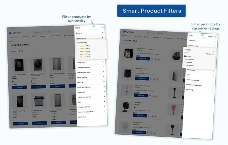
In larger catalogues, search and filters are how shoppers narrow down choices quickly. A search bar that ignores typos or filters that don’t update results properly waste a shopper’s time. A gadget store with no filter for brand or price range is a common example. Fix this with responsive filters, clear filter labels, and forgiving search that handles minor typos. Good search keeps shoppers exploring instead of giving up.
9. A Complicated Checkout Process Increases Cart Abandonment
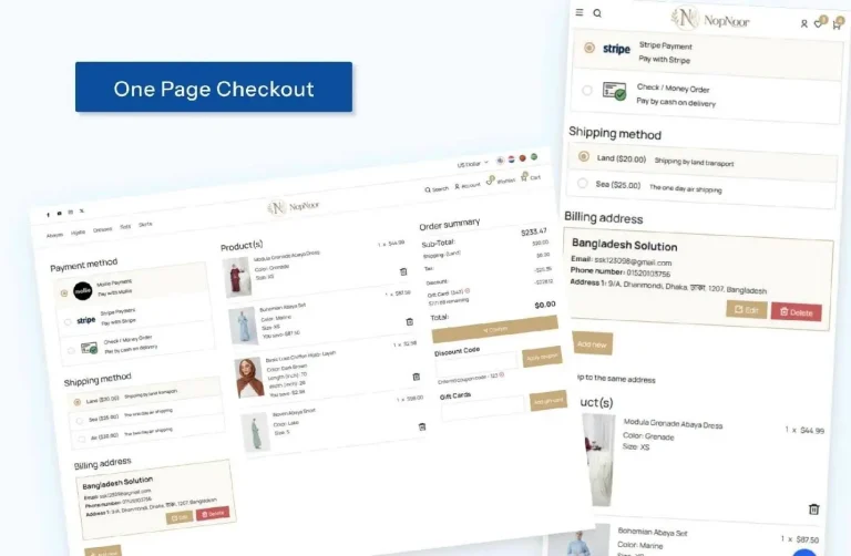
Checkout is the final stretch, and unnecessary friction here is especially costly. Long forms, forced account creation, and unclear shipping costs all add hesitation at the worst possible moment. A checkout that demands ten fields before showing the total cost is a common culprit. Fix this by shortening the process, offering guest checkout, and showing costs early. A simple one-page checkout turns intent into a completed sale.
10. Too Many Pop-Ups and Interruptions Break Shopping Flow
A well-timed offer can help, but stacked pop-ups quickly become annoying. Newsletter prompts, exit-intent offers, and cookie banners appearing all at once overwhelm shoppers. A visitor who sees three pop-ups within their first ten seconds on a site is a common frustration. Fix this by limiting pop-ups to one purposeful moment and making them easy to close. Respect for the shopper’s attention pays off in the long run.
11. Missing Trust Signals Make Shoppers Hesitate Before Buying
Shoppers weigh risk before they buy, especially from a store they haven’t used before. No visible reviews, unclear return policies, or missing security badges all raise doubt. A checkout page with no mention of secure payment is a common gap. Fix this by displaying reviews, clear policies, and recognisable trust badges near key decision points. Visible trust signals turn hesitation into confidence.
12. Choosing the Wrong Ecommerce Theme Limits Growth
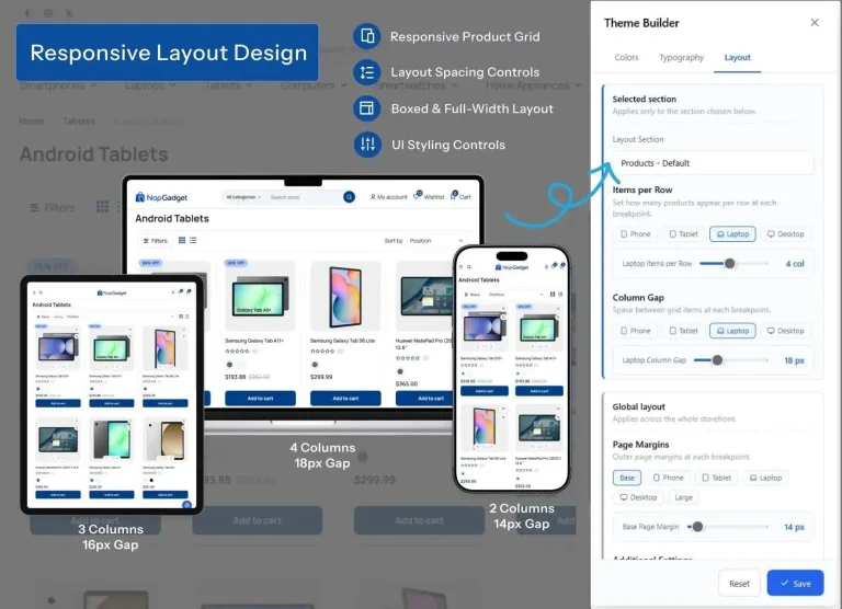
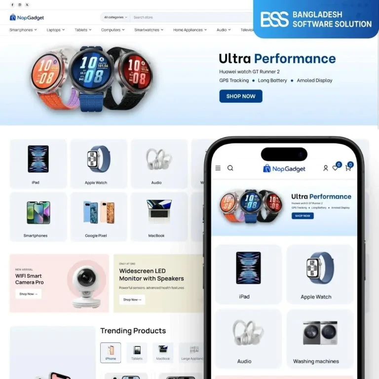
Sometimes the root problem isn’t one page — it’s the theme itself. A theme that can’t handle your catalogue size, lacks flexible layouts, or wasn’t built with performance in mind will keep causing friction no matter how many small fixes you make. A growing gadget store stuck on a theme designed for a handful of products is a common example. In that situation, switching to a scalable, performance-focused solution like the NopGadget Theme can give you the flexibility, speed, and clear product presentation needed as your catalogue grows.
What a Well-Designed Ecommerce Theme Looks Like in Practice
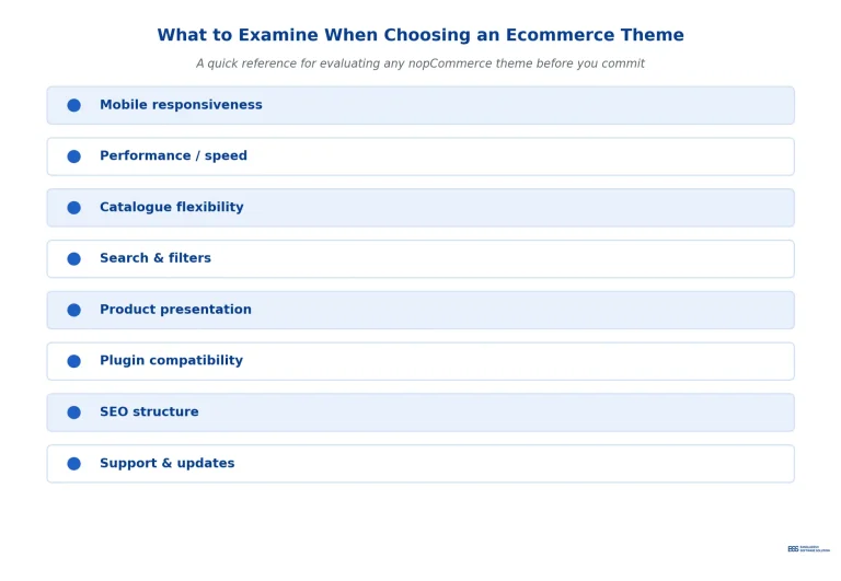
A strong ecommerce theme supports clear product discovery, responsive mobile layouts, and consistent product presentation across the whole catalogue. It should offer flexible catalogue organisation, fast and intuitive shopping, and conversion-focused calls to action that scale as your store grows.
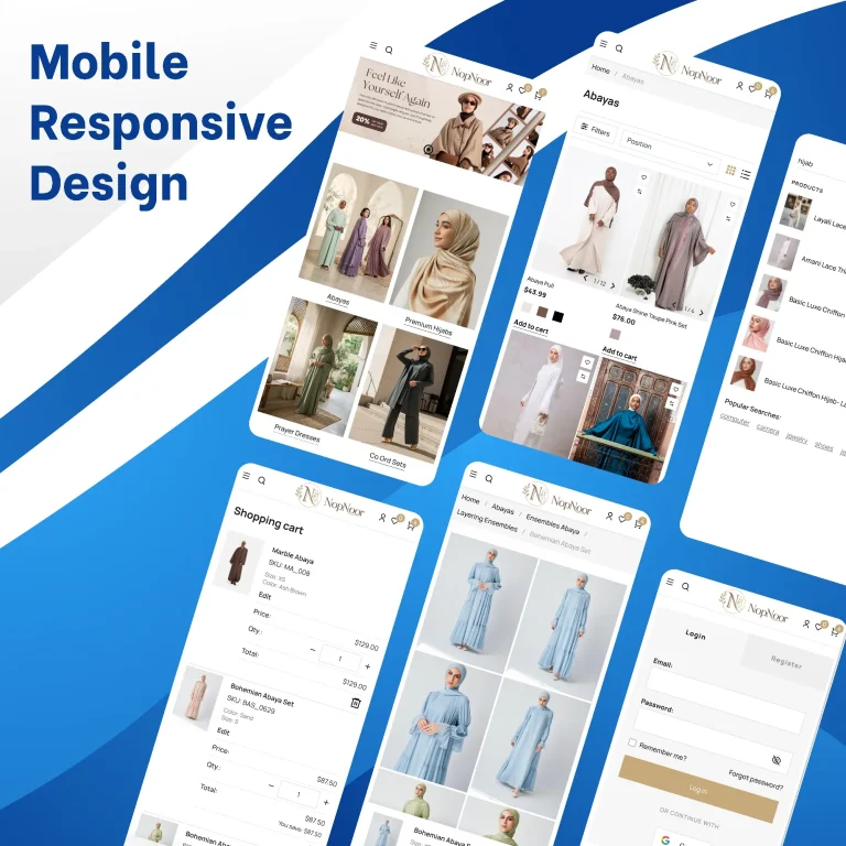
Bangladesh Software Solution builds nopCommerce themes with exactly this focus. NopNoor is a modern nopCommerce storefront designed for a clean, visual, fashion-oriented shopping experience — you can browse the live demo (nopnoor.bssoln.com) to see how it handles navigation and product presentation.
NopGadget takes a more structured approach, suited to electronics, gadgets, appliances, and other product-rich catalogues where search and filtering matter. You can explore it here: store.bssoln.com/themes/nopgadget-theme.
Exploring both examples is a useful way to see how navigation, product presentation, catalogue organisation, and visual consistency can work together in a real store.
Conclusion
Fixing ecommerce design mistakes isn’t about chasing trends. It’s about removing friction, building trust, and making the next action obvious at every step.
Before redesigning your entire store, review where customers may be getting confused, slowed down, or distracted. Exploring practical examples such as NopNoor and NopGadget can help you identify the design patterns that fit your products and customers.