Mastering CSS Grid: A Visual Guide for Frontend Developers
If you started frontend development in the era of float: left or frameworks like Bootstrap, moving to native CSS layout can feel daunting. But here is the truth: CSS Grid is the most powerful layout system ever designed for the web. It allows you to create complex, two-dimensional layouts with just a few lines of code—no hacky margins or heavy framework classes required.
In this guide, we will move beyond the syntax and build a mental model of how Grid works, including the modern features like subgrid that are essential.
The Mental Model: Grid vs. Flexbox
One of the most common questions developers ask is: “Should I use Grid or Flexbox?”
The answer is usually both, but they serve different purposes.
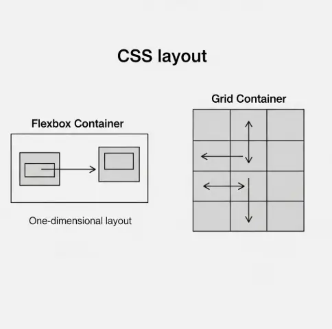
Flexbox is 1-Dimensional: It works in a single line (a row OR a column). Think of a string of pearls. It’s perfect for aligning items inside a navigation bar or a button.
CSS Grid is 2-Dimensional: It works in rows AND columns simultaneously. Think of a chessboard. It’s perfect for the overall page layout.
Core Concepts: Speaking the Language
To master Grid, you need to understand the vocabulary.
► The Container and Tracks
To start, you define a container and tell it how many columns you want
► The Container and Tracks
To start, you define a container and tell it how many columns you want
If you look at the code above, you can actually see the website structure before the browser even renders it.
Visual Positioning: Grid Template Areas
This is arguably the most readable feature in CSS. Instead of calculating line numbers, you can name your areas using an “ASCII art” style syntax. This is excellent for code maintainability.
If you look at the code above, you can actually see the website structure before the browser even renders it.
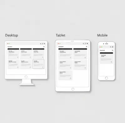
The "Holy Grail": Responsive Layouts Without Media Queries
In 2025, we aim to write less code. CSS Grid allows us to create a responsive card layout that adapts to mobile, tablet, and desktop without a single @media query.
We achieve this using repeat, auto-fit, and minmax.
How this works:
► minmax(300px, 1fr): “I want my columns to be at least 300px wide. But if there is extra space, stretch them (1fr).”
► auto-fit: “Fit as many of these 300px columns into the row as possible. If the screen is too small for three columns, wrap one to the next line automatically.”
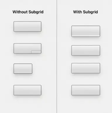
Modern CSS: The Power of Subgrid (2025 Update)
For years, Grid had a limitation. If you placed a grid inside a grid item, the child grid didn’t know about the parent’s tracks. This made aligning items inside separate cards impossible.
Enter Subgrid.
With subgrid, a child element can inherit the grid definition of its parent.
This ensures that if one card has a long title, the “Read More” buttons on all cards stay perfectly aligned at the bottom.
A Note on Accessibility
With great power comes great responsibility. CSS Grid allows you to visually rearrange items on the screen without changing the HTML structure.
- The Risk: You can visually move a ‘Submit’ button to the top of the form using grid-row: 1, but in the HTML, it is still at the bottom.
- The Consequence: Screen readers (used by visually impaired users) follow the HTML order, not the CSS visual order. This creates a confusing experience.
- The Fix: Always ensure your logical HTML order matches your visual intent. Use Grid for layout, not for fixing poor HTML structure.
Summary
CSS Grid is no longer “new tech”—it is the standard. By combining fr units, grid-template-areas, and modern features like subgrid, you can build robust, responsive interfaces faster than ever before.
Ready to start? Open your code editor, create a div with display: grid, and start experimenting with the fr unit today.

